A Guide to Crafting a Reusable and Accessible Slider Component in React.js
11 min read
Introduction
In the ever-evolving landscape of web development, creating components that are not only visually appealing but also accessible to a diverse audience is very important. Sliders are ubiquitous UI elements, they can be found in most things from music players, video player to image editors. But crafting accessible and truly reusable sliders can be a bit tricky.
In this article, we'll delve into the process of crafting a reusable and accessible slider component using React.js. We will guide you through the creation of a custom hook that handles state management, user interactions, and most importantly, accessibility considerations. By the end of this journey, you'll have gained insights into building components that not only meet the aesthetic demands of today's web but also prioritize inclusivity, making your applications enjoyable for all users. Let's embark on this journey to create a slider component that truly stands out for its functionality and accessibility.
Understanding the requirements
According to W3C
A slider is an input where the user selects a value from within a given range. Sliders typically have a slider thumb that can be moved along a bar, rail, or track to change the value of the slider.
From this definition, we can list out the reqired functionality of our slider
- It should have a movable thumb
- It should have a track
- The thumb can be used to change the value of the slider by moving it in the track
- The Slider value can also be changed by clicking on any section of the track
Create custom hook for slider
We are going to create a custom hook to handle the slider state, keyboard navigation and user interaction
Add slider states
create a new file called "useSlider", i will keep mine in a folder called hooks. We will start by adding all the required states
const useSlider = () => {
  const [isDragging, setIsDragging] = React.useState(false);
  const [draggingValue, setDraggingValue] = React.useState(0);

  return {
    isDragging
  }
}

export default useSlider- isDragging: This will be used to add or remove event listeners
- draggingValue: This will be used to track the value for of the slider when dragging. When dragging, the value of the slider won't be changed untill the user stops dragging
Add eventlisteners for moving and clicking
Before we go on to create the functions for eventlisteners, We may as well just defined the props required by the custom hook.
type Props = {
  containerRef: React.RefObject<HTMLDivElement>;
  thumbRef: React.RefObject<HTMLDivElement>;
  max: number;
  min?: number;
  value: number;
  skipValue: number;
  largeSkipValue?: number;
  parseValue?: (value: number) => number;
  updateValue: (value: number) => void;
  onDragStart?: () => void;
  onDragEnd?: () => void;
}

const useSlider = ({
  containerRef,
  thumbRef,
  max,
  min = 0,
  value,
  skipValue,
  largeSkipValue,
  parseValue,
  updateValue,
  onDragStart,
  onDragEnd,
}: Props) => {
  const [isDragging, setIsDragging] = React.useState(false);
  const [draggingValue, setDraggingValue] = React.useState(0);

  return {

  }
};

export default useSlider
here's what each of this props will be used for
- containerRef: This is the slider ref
- thumbRef: This is the thumbs ref
- max: Represents the maximum value of the slider
- min: Represents the minimum value of the slider
- value: Current value of the slider
- skipValue & largeSkipValue: will be used in keyboard navigation to change the value of the slider,
- parseValue: Function used to parse or properly format value
- updateValue: Function to update value
- onDragStart: Callback function to call when dragging is started
- onDragEnd: Calllback funtion to call when dragging has ended
Here's all the functions we need for the eventlisteners
type TouchableEvent =
  | React.MouseEvent
  | React.TouchEvent
  | MouseEvent
  | TouchEvent;

function getPosition(e: TouchableEvent) {
  const obj = "touches" in e ? e.touches[0] : e;
  const { pageX, pageY } = obj;

  return { pageX, pageY };
}

const move = React.useCallback((e: TouchableEvent) => {
  const { pageX } = getPosition(e);
  const { width, left } = containerRef?.current?.getBoundingClientRect()!;
  const percentage = Math.min(Math.max(0, pageX - left) / width, 1);
  const value = percentage * max;
  if (!isDragging) {
    setIsDragging(true);
    onDragStart?.();
  }
  setDraggingValue(parseValue ? parseValue(value) : value);
},[])

const handlePointerDown = (e: React.PointerEvent<HTMLDivElement>) => {
  e.currentTarget.focus();
  e.preventDefault();
  e.stopPropagation();
  move(e);
};

const handlePointerMove = React.useCallback((e: MouseEvent | TouchEvent) => {
  e.stopPropagation();
  move(e);
},[move])

const handlePointerUp = useCallback((e: MouseEvent | TouchEvent) => {
  e.preventDefault();
  updateValue(draggingValue);
  setIsDragging(false);
  onDragEnd?.();
},[onDragEnd, draggingValue])
- getPosition: This function returns the X and Y coordinates of a touch or mouse event
- move: As the name suggests, this function is responsible for updating the draggingValue based on the movement of either a touch or mouse event. This uses the X cordinate returned by getPosition along with the width and left position of the slider container ( you see why we needed the container Ref?) to get the percentage of the value needed. The actual value is gotten by multiplying the perceentage by the max value.
- handlePointerDown: This function is an event handler for the pointer-down event for the slider container. The reason we are calling the move function inside the handlePointerDown function is because we can use the handlePointerDown and handlePointerUp to handle click events (click events fires after pointer down and pointer up.)
- handlePointerUp: This function is an event handler for the pointerup event which we will be attached to the document conditionally. It is responsible for updating the values when dragging or clicking is done.
- handlePointerMove: This is also an event handler for the pointermove event that will be attached conditionally. It calls the move function to update the dragging value when the slider is being dragged.
Now, lets attached this to the eventlisteners
// ...other lines
  React.useEffect(() => {
    if (isDragging) {
      document.addEventListener("pointerup", handlePointerUp);
      document.addEventListener("pointermove", handlePointerMove);
      document.addEventListener("touchmove", handlePointerMove);
      document.addEventListener("touchend", handlePointerUp);
    }

    return () => {
      document.removeEventListener("pointerup", handlePointerUp);
      document.removeEventListener("pointermove", handlePointerMove);
      document.removeEventListener("touchmove", handlePointerMove);
      document.removeEventListener("touchend", handlePointerUp);
    };
  }, [isDragging, handlePointerUp, handlePointerMove]);
This useEffect is used to attach the handlePointerMove and handlePointerDown event to the document only when isDragging state is true. When the dragging state changes or the component unmounts, it removes these event listeners to avoid memory leaks.
So far we have completed handling updating the slider value either clicking or dragging. Now let's handle keyboard events in order to make our slider component accessible via keyboard.
  const handleKeyDown = useCallback(
    (e: React.KeyboardEvent<HTMLElement>) => {
      switch (e.key) {
        case "Left":
        case "ArrowLeft":
        case "Down":
        case "ArrowDown":
          e.preventDefault();
          e.stopPropagation();
          updateValue(value - skipValue);
          break;
        case "Right":
        case "ArrowRight":
        case "Up":
        case "ArrowUp":
          e.preventDefault();
          e.stopPropagation();
          updateValue(value + skipValue);
          break;
        case "PageUp":
          updateValue(
            largeSkipValue ? value + largeSkipValue : value + skipValue
          );
          break;
        case "PageDown":
          updateValue(
            largeSkipValue ? value - largeSkipValue : value - skipValue
          );
          break;
        case "Home":
          updateValue(min);
          break;
        case "End":
          updateValue(max);
          break;
        default:
          break;
      }
    },
    [max, min, value, updateValue]
  );
I believe the above function is self explainable. When the slider component is focussed, for example, clicking the End key updates the value to the max value, and clicking on the Home key updates the value to the min Value.
We are almost done with our custom slider hooks, lets add two more functions
- A function to return the correct width for the rail progress value.
- A function to properly position the thumb on the slider
 const sliderValueInWidthPercentage = React.useMemo(() => {
    if (isDragging) {
      return Math.floor((draggingValue / max) * 100);
    }
    return Math.floor((value / max) * 100);
  }, [value, max, draggingValue, isDragging]);

  const getThumbPosition = React.useMemo(() => {
    const parentWidth = containerRef?.current?.offsetWidth ?? 0;
    const thumbWidth = thumbRef?.current?.offsetWidth ?? 0;
    const halfThumbWidth = thumbWidth / 2;
    const halfThumWidthInPercentage = (halfThumbWidth / parentWidth) * 100;
    const thumbWidthLeftPosition =
      playedProgressInWidthPercentage - halfThumWidthInPercentage;
    return Math.min(
      Math.max(thumbWidthLeftPosition, min),
      100 - halfThumWidthInPercentage * 2
    );
  }, [playedProgressInWidthPercentage, windowWidth, min]);
Now let's put everything together for our custom hook
type Props = {
containerRef: React.RefObject<HTMLDivElement>;
thumbRef: React.RefObject<HTMLDivElement>;
max: number;
min?: number;
value: number;
skipValue: number;
largeSkipValue?: number;
parseValue?: (value: number) => number;
updateValue: (value: number) => void;
onDragStart?: () => void;
onDragEnd?: () => void;
}
type TouchableEvent =
| React.MouseEvent
| React.TouchEvent
| MouseEvent
| TouchEvent;
function getPosition(e: TouchableEvent) {
const obj = "touches" in e ? e.touches[0] : e;
const { pageX, pageY } = obj;
return { pageX, pageY };
}
const useSlider = ({
containerRef,
thumbRef,
max,
min = 0,
value,
skipValue,
largeSkipValue,
parseValue,
updateValue,
onDragStart,
onDragEnd,
}: Props) => {
const [isDragging, setIsDragging] = React.useState(false);
const [draggingValue, setDraggingValue] = React.useState(0);
const sliderValueInWidthPercentage = React.useMemo(() => {
if (isDragging) {
return Math.floor((draggingValue / max) * 100);
}
return Math.floor((value / max) * 100);
}, [value, max, draggingValue, isDragging]);
const getThumbPosition = React.useMemo(() => {
const parentWidth = containerRef?.current?.offsetWidth ?? 0;
const thumbWidth = thumbRef?.current?.offsetWidth ?? 0;
const halfThumbWidth = thumbWidth / 2;
const halfThumWidthInPercentage = (halfThumbWidth / parentWidth) * 100;
const thumbWidthLeftPosition =
playedProgressInWidthPercentage - halfThumWidthInPercentage;
return Math.min(
Math.max(thumbWidthLeftPosition, min),
100 - halfThumWidthInPercentage * 2
);
}, [playedProgressInWidthPercentage, windowWidth, min]);
const move = React.useCallback((e: TouchableEvent) => {
const { pageX } = getPosition(e);
const { width, left } = containerRef?.current?.getBoundingClientRect()!;
const percentage = Math.min(Math.max(0, pageX - left) / width, 1);
const value = percentage * max;
if (!isDragging) {
setIsDragging(true);
onDragStart?.();
}
setDraggingValue(parseValue ? parseValue(value) : value);
},[])
const handlePointerDown = (e: React.PointerEvent<HTMLDivElement>) => {
e.currentTarget.focus();
e.preventDefault();
e.stopPropagation();
move(e);
};
const handlePointerMove = React.useCallback((e: MouseEvent | TouchEvent) => {
e.stopPropagation();
move(e);
},[move])
const handlePointerUp = useCallback((e: MouseEvent | TouchEvent) => {
e.preventDefault();
updateValue(draggingValue);
setIsDragging(false);
onDragEnd?.();
},[onDragEnd, draggingValue])
const handleKeyDown = useCallback(
(e: React.KeyboardEvent<HTMLElement>) => {
switch (e.key) {
case "Left":
case "ArrowLeft":
case "Down":
case "ArrowDown":
e.preventDefault();
e.stopPropagation();
updateValue(value - skipValue);
break;
case "Right":
case "ArrowRight":
case "Up":
case "ArrowUp":
e.preventDefault();
e.stopPropagation();
updateValue(value + skipValue);
break;
case "PageUp":
updateValue(
largeSkipValue ? value + largeSkipValue : value + skipValue
);
break;
case "PageDown":
updateValue(
largeSkipValue ? value - largeSkipValue : value - skipValue
);
break;
case "Home":
updateValue(min);
break;
case "End":
updateValue(max);
break;
default:
break;
}
},
[max, min, value, updateValue]
);
return {
sliderProps: {
onPointerDown: handlePointerDown,
onKeyDown: handleKeyDown,
tabIndex: 0,
role: "slider",
"aria-valuemax": max,
"aria-valuemin": min,
"aria-valuenow": value,
"aria-label": "slider",
},
thumbProps: {
style: {
left: `${getThumbPosition}%`,
},
},
railProps: {
style: {
width: `${sliderValueInWidthPercentage}`
}
}
isDragging,
}
};
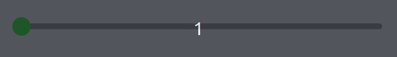
export default useSliderCreate a slider component using the custom hook
We are going to use the custom hook we created to create the slider component
import useSlider from "../useSlider"

const Slider = ({}) => {
    const containerRef = React.useRef<HTMLDivElement>(null);
    const thumbRef = React.useRef<HTMLDivElement>(null);
    const [value, setValue] = React.useState(0);

    const {sliderProps, thumbProps, railProps} = uslider({
        containerRef,
        thumbRef,
        max: 100,
        min: 0,
        value,
        updateValue,
        skipValue: 5,
        largeSkipValue: 20
    })

    return (
        <div
            ref={containerRef}
            {...sliderProps}
            style={{
            margin: "2rem auto",
            width: "100%",
            height: "1rem",
            backgroundColor: "grey",
            position: "relative",
            borderRadius: "1.5rem",
            }}>
            <div
                style={{
                    height: "100%",
                    backgroundColor: "limegreen",
                    position: "absolute",
                    borderRadius: "1.5rem",
                    top: "0",
                    left: "0",
                    width: railProps.style.width,
                }}
            />
            <div
            ref={thumbRef}
            style={{
                width: "3rem",
                height: "3rem",
                borderRadius: "100%",
                backgroundColor: "lime",
                position: "absolute",
                top: "50%",
                transform: "translateY(-50%)",
                left: thumbProps.style.left,
            }}
            />
        </div>
    )
}
And here's the result
Conclusion
In this article we embarked on creating an accessible Slider. By leveraging the capabilities of a custom hook, we've centralized the logic, enhancing maintainability and reusability in our codebase. This approach not only streamlines the slider's functionality but also underscores the importance of accessibility in web development.
Our custom hook took care of intricate details, such as handling various pointer and keyboard events, ensuring a harmonious experience across different user inputs. Incorporating accessibility attributes ensures that our slider is usable by everyone, regardless of their abilities.
PS: Special appreciation to The Man Prvnce for helping design the cover image for this post